
These 5 tips will help you choose the best premade book cover from a shortlist of professional designs. It’s about knowing what to prioritize and what to ignore, all with the goal of choosing a cover that will get you more book sales.
Content List
- Introduction
- Check 1: Does it adhere to genre conventions?
- Check 2: Is the composition strong?
- Check 3: Is it compelling?
- Check 4: Is it ‘close enough’ to your story?
- Check 5: Does it fit with your author brand?
- Conclusion
Introduction
This article isn’t about choosing which cover is ‘prettier’ or better-made. We all know when something looks home-made or professional, Christmas-sweater ugly or tastefully elegant. When I say choosing the BEST, then, here’s what I mean:
The BEST premade book cover is the one most likely to appeal to the highest number of readers who would be interested in buying your book.
There are two important points here. ‘The highest number of readers’ implies that you need a cover with the broadest possible appeal. In other words, nothing weird and wacky, and nothing confusing. The second point – ‘who would be interested in buying your book’ – is just as important. There’s no point appealing to readers who have zero interest in buying and reading your work (more on that shortly).
Before we get started, though, take a moment to imagine your target audience. Imagine the genres and sub-genres they’re familiar with browsing, what covers they’re used to seeing, and what their expectations are. Got it? Let’s go!
1. Does the Book Cover Fit Genre Conventions?
Yeah, I know – this one’s pretty obvious. No author’s going to choose a slapstick wedding scene for the cover of their steamy erotic romance, and your sweet seaside romance probably won’t do so well with an ominous stranger on the cover … but there are a few points I’d like to clarify.
Why is this number one on the list?
The reason you want to stick to genre conventions is because it creates a nice, broad funnel to capture readers who like a ‘type’ of story. On the flip side, it also filters out readers who might NOT like your type of story (therefore preventing negative reviews). Sticking to genre conventions is particularly powerful for romance, where the readers are voracious and willing to giving new authors a try, as long as it’s in their favorite category.
Exceptions to the Rule
Like most things, though, there’s a little flexibility. For example:
(a) Authors who already have a moderate following.
Generally speaking, bigger and more popular authors can afford to be more experimental and individualistic with their covers (more on ‘author branding’ later).
(b) Authors who are making a deliberate choice to be experimental.
There’s nothing wrong with shaking things up, or doing some A/B testing for your book covers, as long as you know what you’re doing and why you’re doing it.
(c) Standout Book Cover Designs.
If you stumble across a premade book cover that’s a total knockout (if a little off-beat), then don’t let convention get in your way. When your instincts are screaming that you’ve found something truly special and attention-grabbing, something your readers will adore, then listen to them! At the end of the day, this is still art, these are your books, and there’s always room for subjectivity.
How to Determine Genre Conventions
Okay, so let’s just assume that it’s best to stick to genre conventions. This holds true as a general principle, and especially for new authors trying to attract an audience. The next step is to thoroughly familiarize yourself with the most common book cover trends and tropes within your category (in other words, the actual category you plan to list your book under). For example, here’s the New Adult & College Romance category on Amazon. The listings change all the time, but I’ll bet you’ll see plenty of hot guys, some pecs and/or abs, some more sensual-looking couples, and some references to wealth scattered throughout.
If time permits, browse the listings regularly while you’re penning your book, so you can get a more thorough understanding of the elements that persist over time. In particular, you should be looking for the following things:
- sweet or steamy?
- dark & moody or light & bright?
- people or no people?
- single guy, single girl, or couples?
- subtle colors or vibrant?
- does setting usually feature heavily?
- is typography a large and prominent feature, or does the image usually dominate?
- is a particular palette common? (ie. pastel colors, neon colors etc.)
This should give you a pretty good idea of what readers expect to see on book covers in this category.
2. Is the Cover’s Composition Strong?
The second most important consideration is composition. Composition is the general structure or layout of the book cover. It’s the way graphical elements are organized, so as not to confuse the eye. This is an extremely important element of book cover design, and often overlooked by authors browsing for their next premade.
Remember, the first time most potential readers see your cover, it will be at thumbnail size. They’re viewing it at the zoomed-out, broad-brushstrokes level. If the composition is weak or jumbled, it’ll look like a hot mess … and they’ll just keep scrolling.
How to identify good book cover composition
(a) Is visual information clearly grouped?
- Is the text grouped in a neat and/or logical manner?
- Does the subject matter stand out clearly from the background, or is it hard to make out?
- Is color used in a clear and consistent manner (ie. it shouldn’t look like it was made with whatever was left in a kid’s crayon set!).
(b) Is visual information organized into a larger structure?
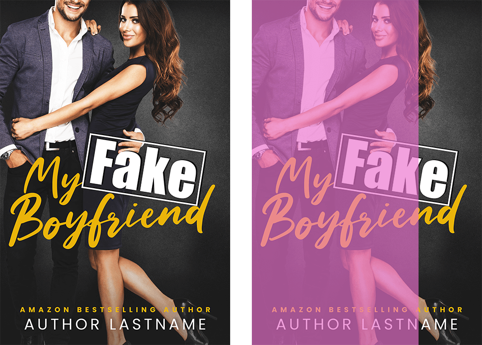
Content placement and size, color, and light/shade all work together to place visual emphasis on different parts of the book. It can be balanced or unbalanced, symmetrical or asymmetrical. The important thing is that there is a clear structure. A good way to find this structure is to look for major shapes and/or angles. Here are some examples.
Example 1.
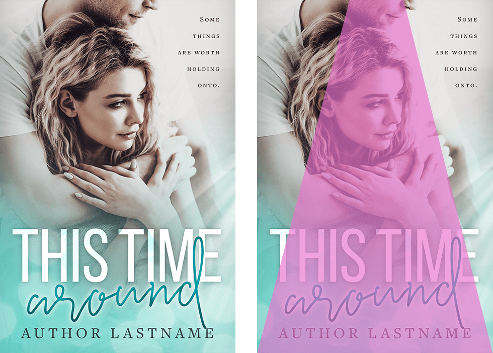
Example 2.
What you don’t want is a weak, confusing, or jumbled structure. This just confuses the browsing reader, and they’ll move on.
(c) Is your eye drawn to a focal point?
This is the cherry on top. In this case, the book cover is not only making it easy to process the visual structure, but it’s drawing the eye to a specific point. It’s saying ‘hey, over here!’ … which, of course, is exactly what you’re saying to potential readers.
Bear in mind that it doesn’t have to ridiculously obvious, either. There’s a good reason so many romance covers feature guys freakishly good abs, or a closeup of a kissing couple, or the vibrant color of a flowing gown. These things automatically draw the eye. A good cover lets these elements do their work, without adding messy distractions.
3. Is the Book Cover Compelling?
At any size, thumbnail or full, your book cover should be compelling. It needs to promise something to the reader – specifically, some kind of emotional reward if they click ‘buy’ and dive into your book. Otherwise, why would they?
This is about more than just picking a cover with attractive people on it (although that certainly helps!). You should be looking for a visual hook, something intriguing. And yes, while this concept is definitely related to the ‘focal point’ I mentioned above, here’s the distinction: while the focal point was a purely visual concept, this one is about story. Depending on your romance sub-genre and writing style, look for a premade cover that is titillating, exciting, intriguing, sweet & flirty, sensual, moving, or whimsical. Note the covers that grab your attention, and try to come at it from the perspective of a reader.
It could be the brazen, challenging look in a model’s eye.
Maybe it’s the strong, dramatic lighting that promises a no-holds-barred kind of story.
Or perhaps, if you’re writing a rom-com, that exploding pink balloon says something to you.
Look for the promise of a story, the hook that triggers your imagination, and you’ll find a compelling premade.
4. Is the Book Cover ‘Close Enough’?
The concept of ‘close enough’
Think about all the books you’ve read lately, and then go back and check their covers. Were their covers a perfect representation of the story, or the characters within? Did you imagine the hero or heroine differently? I’ll willing to bet that in the vast majority of cases, the cover was more about catching your eye than anything else. After all, you picked it up! This is the concept of ‘close enough’. As long as the cover doesn’t completely misrepresent the contents (especially with respect to genre and tone), it’s close enough.
Here’s a scenario…
You’ve found a brilliant premade. It’s genre appropriate, the composition is strong, and it’s so compelling you can’t stop looking at it! But … the girl’s hair is wrong.
On the other hand, you’ve spotted a weaker premade featuring a woman who looks pretty close to the character you imagined … plus she has a Labrador, just like your heroine!
Which do you pick?
Readers don’t know your heroine just yet. They don’t know about her dog. All they know is that while they’re scrolling through Amazon’s New Releases, they have hundreds of books to choose from – and if your cover doesn’t literally slow them down, they’ll just keep on scrolling. I would advise looking at your shortlist of premades through the eyes of a hungry romance reader. Then stop and ask yourself: which is more likely to demand attention? In the scenario I outlined about, it’s the first cover – labrador-free, with the compelling but not-quite-perfect heroine. That’s the one you choose.
Requesting Changes to Premade Book Covers
One final note – I know that some of you are sticklers for detail (absolutely no judgement; I fall into that category, too!). If you want the best premade book cover humanly possible, you can always request changes. Most book cover designers (myself included) do this kind of thing all the time. A small edit – like changing hair/eye color – will set you back an extra US$25 (more info in my FAQs). I’m also happy to do bigger edits, like swapping out the background or changing fonts to better suit the tone of your book. Just send me an email, and I’ll provide a quote for any extra work you want. In the end, it really comes down to a balance between cost and finding a cover that’s ‘close enough’ for your needs.
5. Does the Book Cover Fit Your Author Brand?
This is the last big tip – but that doesn’t mean you should ignore it! In fact, the bigger your author name, the more important this will be.
For example, when you’re just starting out, it’s more important that your cover is strong when compared with its competition. Potential readers don’t yet know you, so the appeal of your book cover is all they have to go on.
However, as your reputation grows, your name will help you stand out from the crowd. When you reach this point, having a distinctive author style might be the way to go.
How soon is too soon?
Wherever possible, try think about your author brand right from the start. Even though it’s not essential, it will help you look more professional right out of the gate. It will also save you the hassle of updating all your book covers down the track (or at least buy you a little more time). If you haven’t considered this too deeply, I’d recommend taking the time to brainstorm keywords and create moodboards that capture the emotions and feelings you want your author brand to stimulate.
Once you have this understanding of your author brand, you can use it as the final check for selecting your book cover. For example, if you want your author brand to be ‘luxurious and sumptuous’, then choose your premade accordingly! In contrast, if you want your author brand to conjure images of country homesteads and wedding cakes, then this should help narrow down your choices.
Conclusion
To summarize, these are my top 5 tips for choosing the best premade book cover, listed in order of importance:
1. Does it adhere to genre conventions? (And if not, do you have a good reason to ignore this?)
2. Is the composition strong?
3. Is it compelling?
4. Is it ‘close enough’ to your story?
5. Does it fit with your author brand?
If you ask yourself these questions, you should be able to choose the premade book cover that will perform strongest for you – in theory, at any rate! In a perfect world, we’d do A/B testing for everything, using a nice big sample of your target audience. But since that isn’t practical, this is the next best thing.
If you’d like any more information, or need specific help, why not start a conversation over on Facebook? I’d love to hear from you!